

Introduction
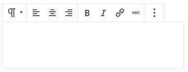
Gutenberg has a number of awesome layout elements to help you build great pages and posts. Here is a quick breakdown to help you get started with them.
The Solution
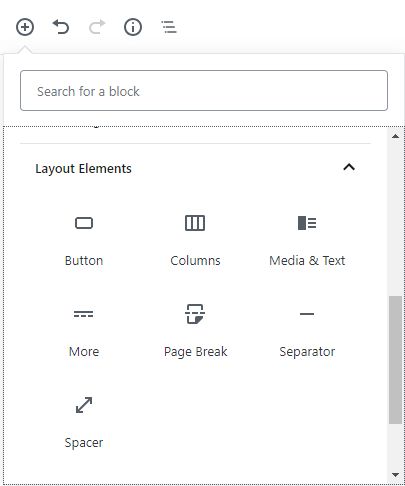
When you click the + (Add block) button in the top left corner of your editor you will be presented with a list of options. Among these you will find “Layout Elements”. Layout Elements are the elements you will be using to format the appearance of your page or post. These blocks include Buttons, Columns, Media & Text, More, Page Breaks, Separators and Spacers. We will briefly explore how to use these different elements.
- Button – This allows you to insert a clickable button into your page or post
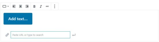
- Once you’ve added a button click “Add Text” to add the text you wish to appear on your button
- In the box below that insert the URL you would like the button to link to, alternatively you could also search for a page or post within your site to link to
- The options at the top of button box allow you to set the alignment for your button as well as format the text to make it bold, italic or add a strikethrough.
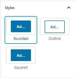
- In the right hand pane you will be given more option to control the look and feel of your button. Using the “Styles” section you can change the button to have rounded or square corners or to make it an outline.
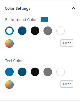
- The color settings panel allows you to change the background and text colors of the button
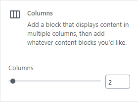
- Columns – Give you the ability to create up to 6 side-by-side content columns in your post or page. You can add these by clicking the +(add block) button in the top left hand corner of your Gutenberg editor and click “Columns” under the Layout Elements section.
- Once you have added a column block, you can choose in the right hand pane how many columns you would like. You can choose from 2 – 6 evenly sized columns
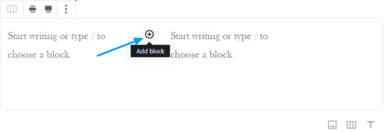
- Once you have decided how many columns to add you can click the +(add block) button within the column to choose the type of content you wish to add to each column
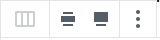
- Using the buttons at the top of the column block you can also choose whether you would like you column block to be wide width or full width. You can also access the “More Options” menu from here
- Once you have added a column block, you can choose in the right hand pane how many columns you would like. You can choose from 2 – 6 evenly sized columns
- Media & Text – This element allows you to insert a side-by-side media and text element.
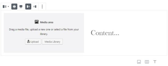
- Using the options at the top of the block you can set whether the element should be wide width or full width as well as set whether you would like the image to be on the left and text on the right or vice-versa.
- In the image pane you can upload an image one of 3 ways: You can drag & drop an image into the box, upload an image from your computer or add an image from the media library
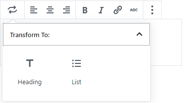
- The text section also gives you a number of formatting options such as setting text alignment, bold or italicize your text, add strikethroughs and hyperlinks. You can also convert the text box to a heading or list.
- The right hand pane gives you additional options to change your font and color settings for the text block.
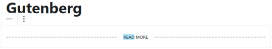
- More – The “More” block is useful for when you want to include an introduction to an article and then link the reader to the remainder of the article.
- Once you add a “read more” block you can then update the text on the break
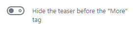
- In the right hand pane there is an option to “Hide the teaser before the “More” tag. Switching this on will hide all the content before the “More” block when the reader clicks through to the full article.
- Once you add a “read more” block you can then update the text on the break
- Page Break – This element is self-explanatory. It adds a page break to your page or post to separate your content
- Separator – The separator is used to create a break between elements or sections. Using the styles tab in the right-hand pane you can choose whether you want the separator to show a short line, wide line or dotted line
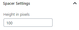
- Spacer – The spacer element allows you to create a space between blocks and elements. You can indicate the height of your spacer using the options panel on the right.
Did you know?
Our friends at Elementor have built a product that’s 10x as powerful as Gutenberg.
Upgrade your site to Elementor and make use of the best sitebuilder in the WordPress ecosystem.
